Analyzing Youtube comments with Natural Language Processing
This project showcases a practical and cost-effective approach to understanding public opinion by analyzing unstructured text data. Using Natural Language Processing (NLP), I extracted actionable insights from thousands of YouTube comments on a controversial professional surfing event.
The outcome was a viral infographic that reached over 90,000 people, demonstrating how to turn raw feedback into a clear, compelling narrative.
Business Value
- Extracting actionable insights from unstructured text (e.g., social media comments, product reviews).
- Gauging customer sentiment and identifying key points of praise or contention.
- Providing a cost-effective and transparent alternative to “black box” AI/LLM solutions for text analysis.
- Validating business assumptions by exploring raw user feedback to discover genuine insights.
Key Skills Demonstrated
- Data Acquisition: Scraping user-generated content from YouTube.
- Data Exploration: Using Node.js for rapid data processing and analysis.
- Natural Language Processing (NLP): Applying a range of techniques (language detection, TF-IDF, n-grams, stemming) to identify significant topics.
- Sentiment Analysis: Assessing opinion through text polarity and emoji usage.
- Data Visualization: Designing an infographic to communicate findings effectively.
- Technical Proficiency: Use of Node.js and its ecosystem (
natural,tinyld, etc.).
Features highlights:
Case study
Contents
- The WSL Championship Tour
- Data exploration
- Data visualization design
- Results
- Closing thoughts: NLP in the age of AI
The WSL Championship Tour
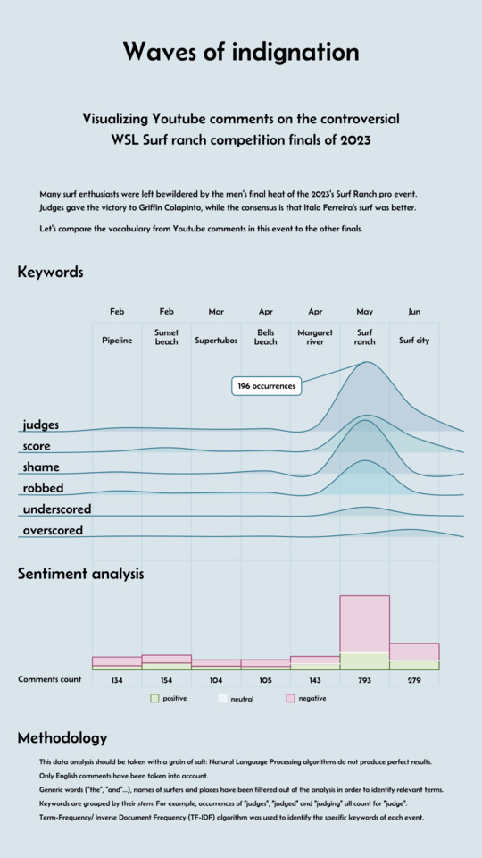
The World Surf League (WSL) Championship Tour is the premier circuit for professional surfing. Each event’s YouTube broadcast generates thousands of comments, providing a rich dataset for analyzing public opinion. This project was born from a desire to see if Natural Language Processing could uncover a consensus within the heated debate surrounding the tour’s judging.
In recent years, a recurring concern among fans and even competitors is a perceived bias against Brazilian surfers. This tension peaked during the 2023 “Surf Ranch” event, where many viewers felt Brazilian surfer Italo Ferreira was “robbed” of a deserved victory against American Griffin Colapinto. The controversy grew so intense that the WSL’s CEO later departed, with some speculation linking it to the controversy, although the official reasons were never disclosed. A subsequent event’s high score for another Brazilian surfer was then seen by many as a clumsy attempt to “compensate”.
This situation raised a clear question: was the outrage specific to these controversial events, or do fans generally disagree with the judges? To find out, I decided to analyze the comments from all the men’s finals of the 2023 season.
Data exploration
What story should we tell, which focus should we have? At the moment, all we have is assumptions, intuitions, about how the public reactions look like. We don’t know for sure, so what we should do is explore the data to find actual insights.
First step is to download the comments. They are retrieved using a small program called youtube-comment-downloader. You give it the Youtube video URL, and it creates a file with the comments data, including comment text, author’s username, whether the comment is a reply.
After getting the comment files, data exploration can start. While I have sometimes used the platform Observable to explore data (here, for example), this time I’m just doing it in a terminal script in node.js. I get text figures instead of visuals, but it’s faster and sufficient.
Comments count
Let’s have a look at how many comments each event got.
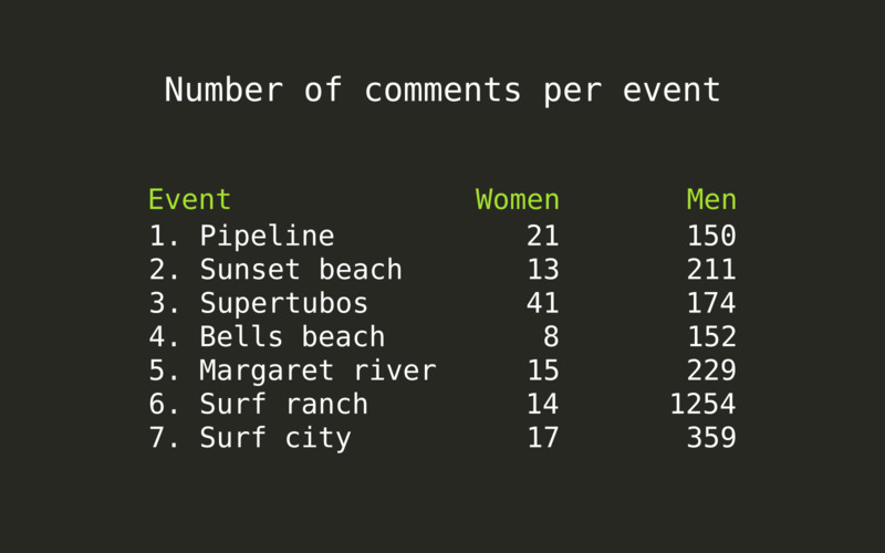
There is a huge difference between women’s and men’s events, the women’s most discussed final in Supertubos getting even less than 50 comments. The number of comments in female surfers’ videos being so low, it does not make much sense to run analysis on them, so the rest of the processing will focus on the male surfers’ videos.
We also notice how heated the discussion was at the Surf ranch finals was, with more than 1200 comments posted, more than 5 times the number of comments of any the other finals this year.
Language detection
First thing we’d like to know is the language used in each comment. Detecting the language of some text has this particularity that the shorter the text, the more difficult it gets. Youtube comments tend to be short: often only a sentence, sometimes just a bit longer, rarely a few paragraphs. The tone is very casual, a lot of abbreviations are used.
Language detection library tinyld has an impressive accuracy compared to other libraries. This is because it attempts to recognize languages’ unique character patterns and word usage (a technique borrowed from machine learning domain), in addition to the classic Bayesian scoring algorithm. Read their algorithm description article for details.
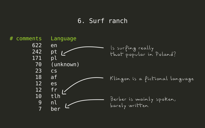
Some of the results look surprising: is surfing so popular in Poland? Is anyone really writing in Berber nowadays? By inspecting a subset of the comments, we confirm that these are mismatches: the acronym of the competition organizer, WSL, confuses the language detection algorithm into thinking that the comment is in Polish language. Some abbreviations like lmao in English or kkkk in Portuguese (coincidentally, both commonly used to express laughter in their respective language), get comments to match with Berber language, and so on.
In order to increase the quality of the results, we limit tinyld to detect only English, Portuguese and Spanish languages. All the other languages will be ignored. We’ll only analyze English and Portuguese comments - the most frequent ones -, but including Spanish in the detection turns out useful in order to avoid having Spanish language comments mistakenly detected as in Portuguese language.
Once the comments languages are known, we’d like to find the most common keywords, for each language. We’ll start to run a few algorithms which will help get quality results.
Filtering, tokenizing and stemming
A few text processing steps are commonly performed in Natural Language Processing, to facilitate text analysis:
- Stopwords filtering: very common words like
and,thedon’t add any value to a text analysis. These therefore get filtered out from the text corpus before running text analysis, using predefined stopwords list for each language, plus a set of hand-picked words: competitors and places names, for example. - Tokenizing: tokenizing consists in detecting individual words in the text. Why is it needed, aren’t the words obvious? Tokenizing is a bit more subtle than just splitting a text based on space and punctuation characters. In English language for instance, contracted forms need to be handled properly: we might want to tokenize
hasn'tintohas+n't. Then,n'tneeds to be interpreted asnot, which is where the next step, stemming, comes into play. - Stemming: Nouns and verbs exist in many variations: singular, plural, conjugated.
Surf,surfs,surfing,surfeddescribe the same concept, and all these words have the same root (stem):surf. Stemming consists in identifying the stem of each word of the text to analyze.
These three data processing algorithms let us see the relevant data, and get more accurate statistics. We use the node.js library Natural for this, as it is pretty fully-featured and supports the languages we want to process.
Finding the top keywords and phrases with n-grams
n-grams algorithms are useful to identify the top words or top phrases in a text. n-grams are phrases of some arbitrary length: bigrams are phrases of length two, trigrams length three, 4-grams length four, etc.
Rather than looking up the most frequently used words in the comments, we want to be smart about it and also detect phrases. If the words professional and surfing are frequently used together, then we want to see professional surfing as a top phrase, rather than professional and surfing as top keywords individually.
While most NLP libraries compute n-grams in a rigid way and ask the user whether they want to count top words, or top bigrams or n-grams of given length, gramophone cleverly identifies phrases depending on how often they are used.
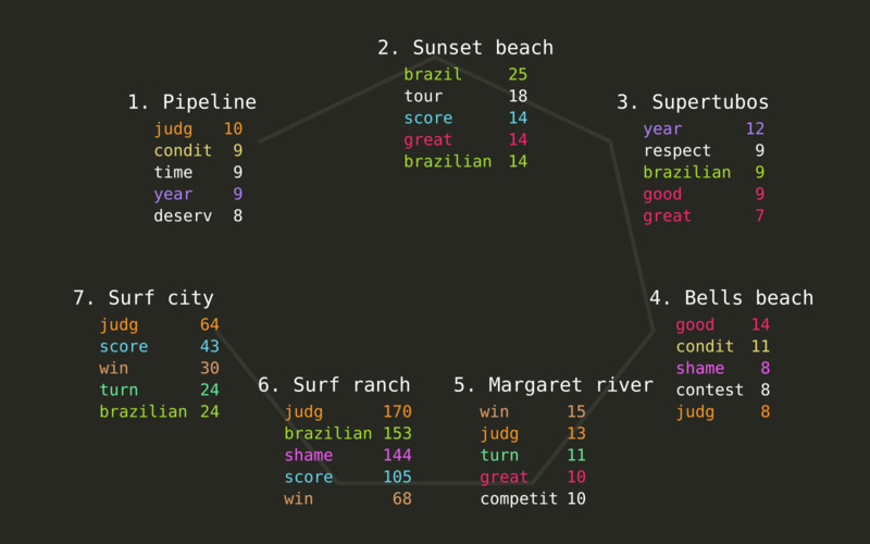
For each event, we get the list of top phrases in English and Portuguese, using the stems previously determined.
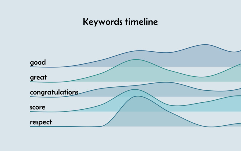
We can see that the topic of judging is quite present, in the top 5 stems of five of the seven events we’re analyzing. Adjectives like good and great are also used a lot, although we cannot really deduct something from them directly: they may refer to the weather conditions for surfing, or qualify the waves surfed, and might be used in negative form as well as positive. The stem condit corresponds to the noun conditions, and is used in many comments in some of the events, for which the weather was not optimal for a surf contest.
Side-note: while only top 5 stems are shown in this article for the sake of conciseness, the top 30 were actually analyzed in the project.
Do we have a story? Well, maybe, but it’s not really interesting. The same terms can be found in most videos, which makes sense, because they are all about the same topic: the finals round of a surf contest.
Fortunately, another text analysis algorithm is perfect to figure out what is unique in each of the videos.
Unveiling the topics specific to each event: tf-idf algorithm
tf-idf stands for “Term Frequency - Inverse Document Frequency”. This algorithm identifies the topics (keywords or n-grams) which are standing out in one text, in comparison to a set of texts.
When applying tf-idf on each event’s comments, the particularity of each one gets clear. This is especially interesting in the last two events.
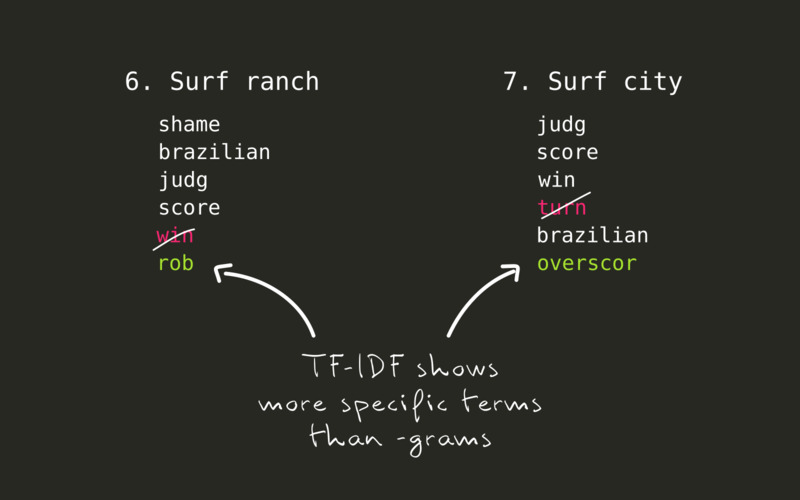
- At the very controversial Surf ranch event finals, instead of
win, the top 5 stems now showsrob. Many comments indeed claim that Italo Ferreira was robbed from the victory he deserves. - In the following event finals in Surf city, many people state that while Filipe Toledo surfed better than his opponent and deserved to win, he was
overscoredand didn’t deserve a 9 for the best wave he took.
Sentiment analysis
Sentiment analysis consists in determining feelings expressed in some text. In its more basic version, we assess the polarity of the comments: whether the feelings are negative, neutral or positive. Natural has such a sentiment analysis algorithm.
Results from such analysis are to be taken with a grain of salt: the algorithm is smart enough to understand negations, but is not able to detect sarcasm, so comments like “What a joke” end up being counted as positive, instead of negative - the term joke being interpreted as positive.
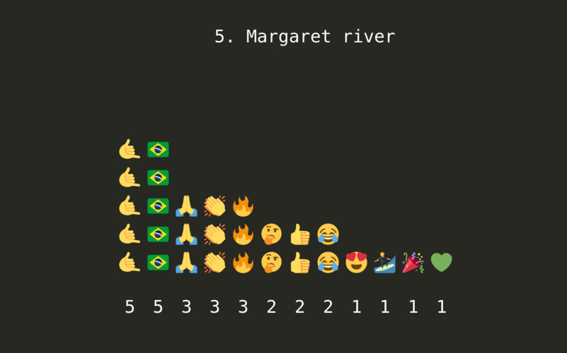
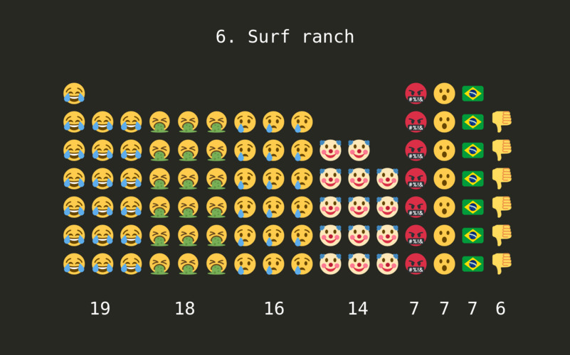
Another interesting area of sentiment analysis is done through looking at the emoji present in the comments. Emoji bring more nuance than simply positive / negative assessment: they can show joy, laughter, loathing, fear, anger, an many more emotions. Interpreting them is still a challenge, though: a laughing emoji can express fun or mockery, based on the context.
Still, comparing the emoji used in each event, we definitely get the picture as to how the public feels:
Data visualization design
While this case study’s focus is the Natural Language Processing, let’s still have a brief look at the design of the infographic.
The purpose of the analysis is to satisfy some curiosity, confirm assumptions, and we don’t aim at taking decisions based on this outcome. For this reason, we can make some choices favoring aesthetics over accuracy.
A ridgeline chart can look great, and its shape of waves is a nod to our topic of surfing.
Because I already had spent a considerable amount of time working on this week-end side project, the sentiment analysis visuals was simplified:
- show the sentiment statistics using a simple bar chart,
- skip the design of a visual to show the emoji statistics was skipped: done is better than perfect.
Similarly, again to save time, inclusion of the comments in Portuguese language was omitted. The same trends can be observed in these comments. They could have been displayed side by side, or even merged, based on the translated terms.
Results
I published the infographic in three subreddits (thematic channels on Reddit social media), focused either on data visualizations or on surfing. 10 days after being published, the infographic got the following reach and engagement results (source: Reddit insights):
channel: r/dataisbeautiful
- 85.7k total views
- Score: 59 (77% upvote rate)
- 25 shares
- 17 comments
channel: r/surfing
- 7.1k Total views
- Score: 35 (97% upvote rate)
- 4 shares
- 4 comments
channel: r/surf
- 1.3k Total views
- Score: 15 (100% upvote rate)
- 0 shares
- 0 comments
Closing thoughts: NLP in the age of AI
Natural Language Processing is a precious knowledge to have in our toolbox, as it is complementary to other data analysis methods.
While there is a lot of hype behind Artificial Intelligence and Large Language Models nowadays, NLP and other traditional methods are definitely still relevant as they provide quality results for a fraction of the cost: they don’t require to train and load heavy models, they don’t need strong processing power or memory to run, and the way how tools work is transparent. In a related note, a research paper just got published, showing that the ‘old school’ text compression technology gzip can outperform Deep Neural Networks for text classification.
Alef is specialized in building web-based data analysis and data visualization solutions.
Do you think you have a challenge for us? Let's talk.