Gonna.surf, structuring complex forecasts into a usable experience
Gonna.surf is an innovative surf forecasting website that translates complex oceanographic data into a simple, visual, and trustworthy surf forecast for surfers of all levels. It was born from a real-world user need and grew into a successful data product, demonstrating a consistent, rapid organic growth and high user engagement.
Business Value
- Proven Product-Market Fit: Grew organically to 146,000+ total visits. Traffic in 2025 was 60% higher than in 2024, continuing a strong year-over-year growth trend.
- High User Engagement: The intuitive design encourages deep engagement, with an average visit duration of over 2 minutes and 5.6 pageviews per visit.
- Market Authority: Our forecast data is now so trusted that it is cited as a source by major AI platforms (like ChatGPT and Perplexity) when users ask for reliable surf conditions.
Key Skills Demonstrated
- BI & Data Strategy: Transforming raw technical data into an intuitive, visual, and user-friendly format.
- Product Management: Market analysis, UX design, and scaling a product from a local MVP to multi-island coverage.
- Full-Stack Development: Astro.js, Svelte, Node.js, SQLite, Cloud Hosting.
- Data Visualization: D3.js for custom, easy-to-understand visuals.
- ETL & Automation: Building a robust, automated data pipeline with Node.js to handle data extraction and processing.
- Business Acumen: Designed and implemented monetization strategies, including a premium subscription model and sponsor partnerships.
Features highlights:

Case study
Note: This case study reflects the project as of 2023. The product has since matured with expanded functionality and refined design.
Being in touch with many surfers while living in Fuerteventura, Canary Islands, I couldn’t help but notice how the existing surf forecasting websites and apps were either providing inaccurate information, or too technical and difficult to read for the majority of surfers.
As a consequence, surfers waste time, energy, and sometimes get themselves in dangerous situations. Some surfers spend hours driving all around the coast to look for a surfable spot, because they didn’t realize that the surf conditions were not good in the places they first went to. Or some others get injured, because they were not aware that today’s conditions were dangerous at the same spot where they had a nice session the previous day.
Witnessing this situation, I took the challenge of finding more accurate data, and presenting it in an easier way.
Contents
- Challenge: Interpreting surf forecast is difficult
- Designing an easier solution
- Technology choices
- Results
- Closing thoughts
Challenge: Interpreting surf forecast is difficult
A surf session at a given surf spot can be so different, depending on the weather conditions. Some days, you catch one wave after the other, some other days, you need to wait for 15 minutes between each set of waves. Sometimes, you need to be constantly paddling, as currents make you drift away from where the waves break. On ‘clean’ days, glassy waves offer long rides, and when it’s windy, you might only be able to take off, do just one or two turns, before the wave fades away.
The island of Fuerteventura, where I’m living, has surf spots in all coasts. Surfers spend a lot of time driving around, looking for a place where surfing is good. Time and fuel are wasted, if we go check for the wrong coast.
Some conditions make the surf dangerous, so it’s really important to be able to determine how the situation is.
It’s not just about how big or powerful the waves are. Some other factors also in play are:
- swell power and direction,
- wind speed and direction,
- tide level,
- bathymetry around the surf spot,
- movement of sand banks.
So ideally, as a surfer, you would need to study and be able to interpret a multitude of measures, to decide when and where to go surfing.
This is not so easy, requires quite some learning and experience. Many beginner and intermediate surfers need an easy way to get the information, without having to study the technicalities.
In the end of 2021, the most popular surf forecasting app in the area where I live - called magicseaweed - was relatively user-friendly, but the data provided was quite inaccurate. Some other websites using other data sources were more precise, but more technical, and only used by more advanced and geeky surfers.
I needed something else, as I often found myself having to open three different websites and apps, comparing the data they provide, in order to decide where and when to go surfing.
Being in touch with many other beginner and intermediate surfers, I also saw a need for a solution easier to understand. Many of them only look at the wave height information and ignore the rest, while some other resign themselves to only look at the tide level, because they find the other available information to complex.
Designing an easier solution
Gonna.surf website and mobile app has been created to offer a balance between ease of use and completeness of data.
Beyond surf forecasting, it also features:
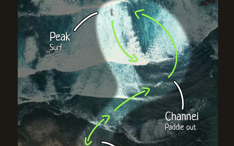
- visual surf spot guides, helping newcomers try new spots safely,
- a surf knowledge base, to provide free education about key aspects of surfing: safety, technique, communication…
Let’s have a look at some aspects of the design process which led to the creation of gonna.surf.
Making it simple
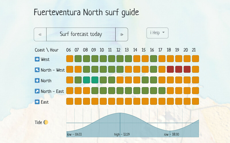
A system of red / amber / green / teal colored indicators has been created, and synthesizes an interpretation of all available factors extracted from the forecast. Colorblind people - which are about 8% of the population - can switch to a palette offering more distinguishable colors.
While there is no perfect formula to determine how good or bad the surf conditions are going to be, and these are also a matter of personal preferences. However, the indicators provide a baseline.
Some of gonna.surf users, less experienced in surfing, don’t want to see any measure or detailed information, and solely rely on this indicator to go surfing.
A summary table shows them these for the whole day, in each coast of the island.
Keeping it complete and user-friendly
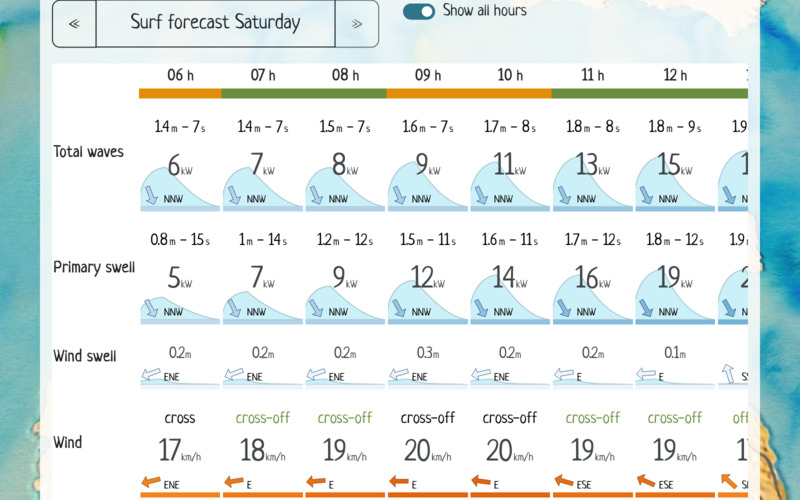
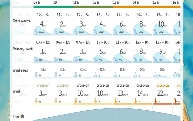
The detailed surf forecast pages show all available forecast measures values. Visual representations are provided whenever relevant, to keep the solution user friendly.
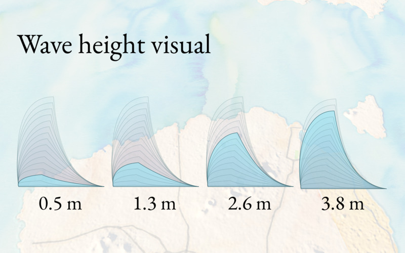
For example, instead of just showing wave height measure, an image representing a wave of given size is displayed. This makes it easy to visually scan the forecast table, and see how the swell evolves hour after hour.
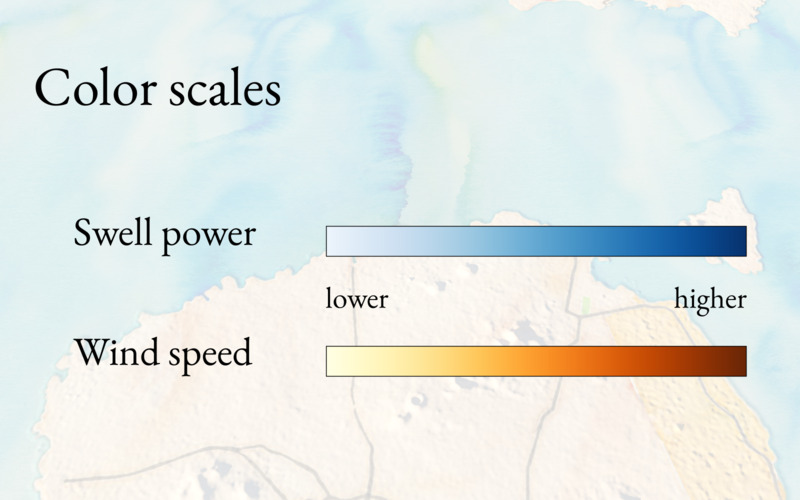
Swell power indicates how strong the waves are likely to push, and how much current there might be. Wind speed also affects the quality of the waves. For these, a colored bar below the measure values provide visual cues about how high or low they are.
The detailed surf forecast makes it easy to check how the surf is likely to be at a given hour, and to get the evolution during the day.
Making it fast
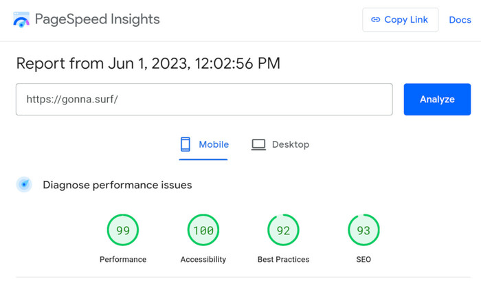
Gonna.surf is lightweight and optimized to load fast - it gets a 99 / 100 score on Google’s Pagespeed Insight test . This performance lets surfers check the forecast on the go, where the cell coverage is bad. The competitors’ scores are between 10 and 50 / 100.
How can it be so optimized? Was some enormous amount of engineering necessary to get the speed and SEO optimization?
Actually, not at all. Simply following best practices, avoiding bloated frameworks, and thinking before developing. There is so much literature on the topic, it’s a question of culture and understanding on how the web works.
Making it automated
Because the website is local, some people tend to think that I manually type in the data a couple of times per day. It is not the case.
From day 1, the retrieval of latest forecast has been automated. It is not so costly to do so, and gives me the freedom to work on other aspects of the project - or other projects and client work.
Technology choices
Website
Initially developed using Svelte Kit, the site has been migrated to Astro framework - still using svelte components.
The static pages (knowledge base, spot guides, help sections) are pre- generated on the server (SSG), in order to be served as quickly as possible. Surf forecast pages, for which the content changes more frequently are rendered on the fly on the server. This combination is made easy thanks to the hybrid mode offered by Astro.
nginx is configured to serve the pages with top performance and security.
Data visualizations
Being a bit of an artisan, I always liked to use d3.js directly, rather than a higher-level charting framework. This is because d3 offers a total freedom on the design of the visualizations, whereas the charting libraries are often limited in terms of customization and interactivity. This comes at a cost: besides d3’s higher learning curve, there is generally more code to write, and more headaches when having to manage visualization of nested data.
In this project, d3 was limited to generating the visuals, and the interactions and reactivity are done using svelte. The approach used by svelte is different, as it inherits of the design concepts from popular web frameworks like react.js and vue.js. Overall, it ends up being easier to work with than using d3.js alone, especially when maintenance is needed.
Data Integration
Node.js powers the extraction and processing of weather forecast data from the API provided by the Spanish weather agency. As I always do, the data extraction is running in a separate process than the web server. This is to avoid any possible interference: if the data processing fails for any reason, the pages are still served (and use latest successfully extracted data).
You might wonder why a scripting language was used instead of an ETL (Extract, Transform, Load) tool - especially since I am an analytics professional. I definitely advocate for the use of ETL tools over scripting in larger projects, where a team is involved, and a higher number of data processing jobs need to be executed and maintained. In Gonna.surf, only one data provider is in scope, and the number of API endpoints to query is limited. Node.js is great for this use case, and fully featured. The framework is very mature and robust. Also, because node.js is already used to power the website, less tools need to be installed, configured and maintained for that project.
Node.js offers the following either out of the box, or thanks to its available ecosystem of modules:
- scheduling
- retrieving data from (anywhere) in the web
- data processing: filtering, calculations, mapping…
- saving data to databases or files.
- monitoring and alerting
Results
January 2025 update: Gonna.surf has continued to grow and evolve. Here are some of the key highlights.
- Audience Growth & Engagement: The platform has seen remarkable organic growth, more than doubling its traffic year-over-year and now serving over 146,000 visitors.
- Becoming an Authority: Beyond strong SEO rankings, Gonna.surf is now recognized as a trusted source by major AI language models like ChatGPT and Perplexity, which cite its data for surf condition queries.
- Major Geographic Expansion: The service has expanded from the north of Fuerteventura to cover all the main surfing islands of the Canary archipelago (Lanzarote, Gran Canaria, and Tenerife).
- New Business Ventures: The product has matured with the launch of a Premium subscription for extended forecasts, local business sponsorships, and a surf photoshoot booking service.
- Continuous Improvement: The user experience is constantly being refined, with a major UI and branding update, more reliable forecast ratings, and the introduction of plain-language narrative descriptions of the surf conditions. A mobile app is also on the way for the Google Play Store.
General perception and adoption
People tend to avoid having to switch tools. This is natural, and universal. Why make the effort to learn and try to understand new information, get used to a new presentation, and new features? While Gonna.surf makes some well known information easier to read and access, it features prominently the swell power measure, with which many less experienced surfers are not familiar.
Despite this learning curve, gonna.surf has managed to attract and grow a userbase, ranging from 600 to 900 monthly users at the time of writing - while solely covering forecast for the North of Fuerteventura island, and without relying on any form of paid advertising.
Dozens of people really like the product and made the effort to send support messages, as well as constructive feedback.
Search engines ranking
Some factors would lead to think that gonna.surf would not rank well on search engines: the website doesn’t have many pages (about 30, versus thousands on competitors’ sites), there is not so much text in them, and the site is young and has very little backlinks.
Still, Google search engine seems to really like the site, and some of the pages already rank in the top 5 results for relevant keywords, only months after having been published.
This can probably be explained by these facts:
- gonna.surf is lightweight and loads fast
- gonna.surf is mobile-friendly
- the content is helpful and focused on the topic
Closing thoughts
As a Business Intelligence project, gonna.surf’s appeal is in the user-centric design, presenting easy and visual insights instead of technical measures.
As a side project, it is great to see that a robust platform can be built quickly, and offer a refreshing experience relevant for its audience.
I would love to take gonna.surf and create a startup from it. Many business models could be integrated in the platform. I also have a hundred more ideas on how to enhance the website. Time is limited, and having a business co-founder with whom to develop the concept would be great. Don’t hesitate to get in touch if you might be that person, or if you know someone else who would.
Alef is specialized in building web-based data analysis and data visualization solutions.
Do you think you have a challenge for us? Let's talk.