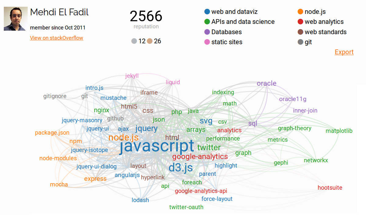
myTagOverflow is a free web app that generates a data visualization showing the tags on which you are most active on stackOverflow.

TL;DR: Try it, you’re three clicks away from getting your own graph ;)
Story
As I was updating my website’s home page a few weeks ago, I though about using factual data to demonstrate my technical abilities, rather than just writing about them.
I investigated possible data sources. First, I had a look at gitHub, which I use for most of my development work, and project management. It turned out that their API isn’t very convenient for extracting the information I am interested in.
Then I had a look at stackOverflow, the leading forum for developers. I’m active there from time to time, as some questions present interesting challenges and are good exercises. Their API makes it easy to get the top tags (technologies / concepts) on which a user is active, and there is also an endPoint which can be used to determine the number of questions common for two given tags.
This is great, because it lets us build a graph, and use cool graph processing algorithms (#dataScienceRocks 👌 ).
Fast forward a few days of hacking and there is now an implementation that looks good enough to release.
How to use myTagOverflow
It’s pretty straightforward to use:
- Click “Login” to grant access to your stackExchange account. Your graph is generated
- Complete the legend by giving a meaningful name to each group of tags.
- (optional) Drag-and-drop the tags if you’d like to adjust the layout.
- Click on the Export button to save the graph as an SVG file.
Try it yourself and contribute
Get your own graph here .
This is a first implementation, extra features could be added:
- get data from other stackExchange sites
- Support export as a png image, in addition to SVG.
- show progress during the data extraction
We’re open to contributions from other developers. If you’d like to enhance myTagOverflow, get in touch ;)
