Out of date - Hi, this article was written back in 2014 and is partly obsolete. Some of the libraries listed below are not maintained anymore.
Now in 2023, I mainly work with d3.js, and I'm a bit outdated on what might be a good choice for high level charting. I think that Vega and vega-lite might be good options.
For advanced use cases d3.js is still amazing and has been split in modules, so that you can only use the parts relevant for your projects - and combine with other libraries if needed.
Web developers often ask me which charting or data visualization library they should choose for their projects. There are plenty of solutions available, several approaches and various levels of maturity. Based on what you are trying to achieve, different tools may be relevant.
I’ve narrowed down the use-cases in three categories, and recommended a personal selection of mature and stable solutions only.
- Reporting and dashboarding: fully featured charting libraries recommended for most situations.
- Advanced visualizations: more flexible solutions for data-intensive and highly interactive projects.
- Specialized libraries: for specific requirements - maps or graph visualizations.
Then for those of you who want to explore more tools, I’m also sharing my bookmarks.
TL;DR
Here’s a visual summary of the solutions I recommend.
Click on the libraries names to visit their websites. Recommended ones are in bold
Reporting and dashboarding
Some libraries are fully-featured and cover the most common requirements. Three characteristics you care about are:
- flexible - you should be able to customize the visuals
- interactive - more than eye-candy,
- responsive - scale well on any device
- minimal learning curve - efficiency never hearts
- cross-browser compatible - this is a pain, let the library handle it for you.
My recommendations are:
Both Highcharts and Fusion charts are commercial open source tools, with reasonable pricing. They are stable and mature, and work well on older browsers (IE6+). Hicharts is free for non-commercial projects.

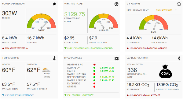
Example dashboard from fusioncharts.com
An alternative solution is Google charts, which is free. The charts are hosted by Google, and you have a far lower flexibility regarding the customizations you may put in place. If you opt for this one, have a contingency plan for the situation when Google stops providing the service.
Advanced visualizations
Sometimes you need more:
- less common chart types
- data-driven approach
- extra flexibility
Then there’s one solution for you: d3.js. It’s not a charting library, but data-driven visualization framework. You put data in, and have all you need to manipulate to generate the output you want. It contains so many essential primitives that make the work so easy. Developers fall in love with d3 because it makes it more convenient to manage the data binding to the DOM. It’s the rolls-royce of web-based dataviz tools. Strong, powerful, it is also free, open source, and there’s a vibrant community around it.

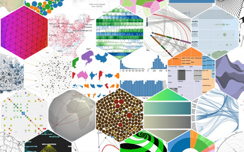
Example d3.js visualizations (source: d3js.org)
You may have stumbled upon the awesomeness of some visualizations created by Mike Bostock (the creator of d3.js) in the New York times, e.g. Over the Decades, How States Have Shifted or Sochi 2014 Interactive Stories.
So, as d3.js is so awesome, why should anyone ever use the libraries from the previous categories? Few things to have in mind:
- The data-driven approach of d3.js is pretty different from the logic of other libraries, so there’s some extra time required in understanding how it works. Consider this learning curve seriously.
- d3.js is not a charting library, you’ll have to build your own re-usable charts templates or use one of the existing ones built on top of it - although, some charting libraries are built on top of d3.
- d3.js does not provide cross-browser compatibility out of the box, although many hacks exist to implement it.
So, if you need charts for a business project and not just for the fun, don’t have too much time, and are not familiar with d3.js, better stick to the plug-and-play tools, you’ll get the work done quicker and more easily. If you really have problem with them, then be welcome in d3.
In the same category, it’s also worth mentioning Raphaël, a “small JavaScript library that should simplify your work with vector graphics on the web”. Raphaël makes it easy do draw things in SVG, and renders properly across all browsers (IE6+). Raphaël is less suitable for charting, but it might be a good choice to design infographics.
Specialized libraries
I thought I should mention solutions answering to some edge-case requirements.
maps
To draw maps, specific products do the job very well. Have a look at Openlayers and leaflet.

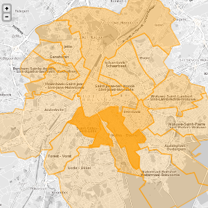
Chloropleth map visualization made with Leaflet
d3.js can also help you do very advanced things, like using less common projections or combining interactive map with other charts. See more than 200 examples, and a tutorial to get started.
Graphs

sigma.js graph
While d3.js deals well with graphs, you might prefer to use sigma.js in case you’re only dealing with graph visualizations. It’s more plug-and-play, you can create very smooth interactive graphs very easily. Early 2014, version 1.0 was released, providing a more consistent API, making it easier to hack the default settings and extend sigma.
It is free and open source.
In terms of performance, I consider d3 and sigma as equivalent, with a small advantage for sigma. These libraries are suitable for small graphs (up to a few thousand nodes) out of the box, and you need to hack them in order to get a suitable performance on larger graphs. In terms of technology, both libraries let you render the way you want; d3 is more tied to SVG, whereas sigma has a canvas and a webgl renderer built-in.
To my eyes, another advantage sigma has over d3 for graphs is the built-in Force Atlas 2 algorithm, which is produces better results when you want to represent social graphs. d3.js’ force layout algorithm tends to be difficult to tweak in order to highlight a community structure. Your mileage may vary, for many use cases this difference is not important.
More
While this article focuses on tools, it’s also important to know how to create good visualizations. The Visual Display of Quantitative Information by Edward Tufte is a reference writing. There’s also this ebook available for free online: Data Visualization with JavaScript which may be of some help.
The personal selection of libraries presented above is far from exhaustive, my criteria to include tools was the maturity of the products. There are many other libraries that are worth having a look at. Here are some links from my personal bookmarks that I have tagged with “chart”, in no particular order. Let me know in case some of them are broken.
- mindmup.com
- github.com/andreaferretti/paths-js
- www.lovelycharts.com/
- chartio.com/
- processing.org/
- github.com/RandomEtc/mind-gapper-js
- www.jstat.org/
- smoothiecharts.org/
- nickqizhu.github.io/dc.js/
- www.drasticdata.nl/DDHome.php?m=0
- flowingdata.com/
- www.aquire.com/
- g.raphaeljs.com/
- code.google.com/p/flot/
- bonsaijs.org/
- tenxer.github.io/xcharts/
- jsplumb.org/jquery/demo.html
- www.diagram.ly/
- selection.datavisualization.ch/
- www.graphviz.org/
- vschart.com/
- github.com/novus/nvd3
- jolicharts.com/
- polychart.com/
- nvd3.org/
- humblesoftware.com/flotr2/documentation
- www.polychartjs.com/
- www.chartjs.org/
- trifacta.github.io/vega/
- misoproject.com/d3-chart/
- dimplejs.org/
- github.com/Quartz/Chartbuilder/
- datawrapper.de/
- timeline.verite.co/
- www.draw.io/
- github.com/benfred/venn.js
- plot.ly/
Full disclosure: While I have contributed in some of the open source tools recommended in this post, I am not affiliated with any of them.
