A sublime
landing page
How to convince visitors to buy on the web
Press space or scroll down to read more.
Wes Bos is a web developer and writer, who achieved great success with his book Sublime Textbook.
The website sublimetextbook.com is designed for persuasion, and generated about $80K revenue in 3 Months.
This articles tries to unveil the story behind this success.
The other day, reading about
profitable side-projects on Hacker News,
one comment caught my attention.


wow!
Curious, I visited the website and
discovered an extremely well executed
landing page.
Wes Bos, its creator,
actually applies many professional sales techniques
on the page.
I reached out to Wes,
and asked about his conversion rates.
"It's about 3-4% right now - which is great. I'm going to try more things to increase that."
When we applied the techniques shown in these slides
for our client, smoall.com they experienced a
328% increase!
in the performance of their landing page

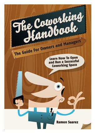
We also increased sales conversions amongst non-bounce visitors at coworkinghandbook.com from 5% to 32%

How does it work?
Let's put ourselves in a prospect's shoes
and have a look.
In case you're too busy to read the next 30 slides,
here are the key take-aways
- Stay focused on the page's goal
- Hook your prospects by talking about the problem you're solving for them
- Put the benefits in front, not the features
- Try to apply Cialdini's 6 principles of influence
- Price smartly
Get in touch if you need any help :)
Let's see how the page looks.
It all starts with
Benefits.
You're not being sold a book.
You're getting extra skills, and time for yourself.
The headline explains the
problem
solved by this product.
Feeling this pain? You may want to read more.
Features
Advantages
Benefits.
This short text connects the dots.
Notice the thoughtful use of bold text
highlighting the key ideas for quick scan.
Already convinced?
Call To Action
The button is prominent
and its message is straightforward.
The site is
mobile friendly
of course.
Lesson 1
State the problem you're solving
People buy products and services that solve a problem they have.
Clearly stating the problem qualifies your audience.
Lesson 2
Highlight the benefits
of your solution.
Features by themselves are pointless.
This is the way sales work.
Scroll down. Next thing you see:
Social proof
Testimonials by reputable people.
This is one of the six principles from Robert Cialdini's
theory of influence.
At this stage,
you know that this product
- solves a problem you have,
- brings you attractive benefits,
- is trusted and recommended by other people.
You're ready to hear about the features!
before diving in the details,
you're reassured that it's a
full-featured
solution.
Then the features list is
exhaustive.
You should find what you're looking for.
Curious?
You may have a taste, no strings attached
This is to
demonstrate the quality
of the solution.
Features listing and preview is
repeated
for each component
of the offer.
This product
- solves a problem you have,
- brings you attractive benefits,
- is trusted and recommended by other people.
- and has the features you need.
You should be
Ready to buy!
The two packages are
easy to compare.
Actually, there's a third package
at the bottom,
suited at a less common segment.
Extra assortments
provide extra opportunities to sell.
The next tool used is
scarcity.
A time-limited discount is available.
Scarcity encourages prospects to act early and buy before the discount is withdrawn.
This above
reinforces the social proof.
Wes told me this single change definitely
increased sales.
Commitment
and
Consistency
Because you committed to
clicking on the yellow buttons ealier (download free sample),
You're more likely continue that commitment
and click again on buttons that look the same
without realizing it..
You may need more convincing,
and Wes will have you
do the math by yourself.
He lets you
measure the benefits and
compute the break-even, based on
your own parameters.
More than a plain introduction,
this demonstrates the seller's
Authority.
FAQ is here to
give extra practical details, and
respond to objections
you may still have.
Social sharing has not been mentioned until now because this page's
focus is selling
Even here is it not very prominent.
Sharing can be done after the sale is concluded.
The disclaimer at the bottom
not only shows the
integrity
of the author, it's also
an extra social proof.
This is a great conclusion because
while it repeats the value proposition,
it's definitely
not pushy.
Wrap up
- Keep your landing page focused on its main goal
- Don't try to sell a product/service. Instead, offer to solve a problem
- Show the benefits and advantages of your solution before talking about features.
- Try to apply Cialdini's 6 principles of influence
- Show, don't tell
- Be creative when creating your packages, and think about all segments
- Don't be pushy.
References
Read these to learn more about sales and pricing:
- Influence: The Psychology of Persuasion by Robert B. Cialdini
- Solution selling
- Price Intelligently's blog about pricing pages
- Michael Dearing on Pricing
Disclosure: I'm not affiliated with any of the people and companies mentioned in this list.
About us
We're Alef, a freelance activity using data to help businesses sell more online.
Have a look at our services offering.
You next?
There's always room for improvement.
Like this article? Spread the word on twitter, facebook or linkedIn.